If you’ve never experimented with Power Pivot in Excel, and you work with data with hundreds or thousands of rows, you’re probably sick of V-Lookups, index/match, and other frequently used Excel formulae. Even though Power Pivot may have a steeper learning curve, getting acquainted with it will save you countless hours in the long-run.
This article will describe 3 of the coolest things Power Pivot can do to save you time, improve your analyses, and help you create amazing, interactive dashboards.
Create Relationships Between Tables in Power Pivot
To be able to fully harness the capabilities of Power Pivot in Excel, it’s important to understand how relationships between tables work.
Whether you added two tabs from a workbook into Power Pivot, or added 5 queries from Power Query to your data model, you will need to create relationships between the tables. There are a few key things to remember when creating relationships:
Each table must contain a Common Column
Creating a relationship between two tables allows you to access the data from both tables, and Power Pivot needs to know how to relate the data. Usually, this will be a primary key, such as a name or customer number. Other examples could include a product number, UPC number, e-mail address, or even a phone number.
One of the Two Tables Must Contain Only Unique Values in the Related Column
The table with the unique values in the related field should contain exactly one instance of every possible value that may be found in your other tables. It’s okay to have other columns of data in your lookup table.
Relationships within the data model operate on a one-to-many basis, meaning the lookup table containing unique values can be related to a column in another table that contains many of the same value.
It also means that your data tables can, and should, contain duplicate values in its related column. Once you ensure that you’re using Clean Data in your data tables, and create relationships to the Lookup Table(s), you’ll be able to aggregate data from multiple tables to use in Pivot Tables and Charts.
Create Pivot Tables with Data from Multiple Source Tables
Prior to Power Pivot, Excel didn’t really offer a user-friendly way to combine data from multiple tables. Based on my experience, V-Lookups seemed to be the Band-Aid solution, and those that were a bit more advanced, tended to use the Index and Match functions. If you weren’t able to write any code (in SQL, R, Python, VBA, or others), it was very difficult to analyze data from multiple sources.
Here’s an example that I just created, that will hopefully be a good representation of what’s possible with Power Pivot in Excel. I wanted to see if there is any correlation between Olympic medals, and the World Economic Indicators of the participating Countries.
Here is the source data if you want to try to replicate the result below, or create your own Pivot Tables or Charts:
You can download the Olympic Medal data directly from Google Docs here, and save it as a .csv or .xlsx file. There are multiple tabs, but I prefer to use the raw data on the ALL MEDALISTS tab.
I downloaded the World Development Indicators data set from worldbank.org’s website. If you want to follow along, visit the link, and select the options you want to see in your data. I suggest selecting All Countries, and All years that are available prior to 2008, to match the Summer Olympics data. Then choose the Metrics you’d like to include in your Analysis. I chose 14 different options from within the Series drop down.

Even though the website will only show you the data for one country (Afghanistan in my case), when you download the export, it will contain a clean table with all of the countries and metrics. It also includes a tab with descriptions of each Series that you included. Don’t forget to scroll to the bottom… You may want to remove a few rows when you import the table!

There are endless ways you could use this data to create a report or dashboard. For the sake of simplicity, I performed the following steps on this data set:
- Removed the null and “Last Updated: “ values from the first Column.
- Filtered the Series Name, and chose one to include that seemed to contain the most data. I ended up choosing “Insurance and financial services (% of commercial service imports)”.
- Selected all of the Values Columns, starting with the 4th Column, and replaced the “..” value with null. I also changed the data type of all of these columns to be a decimal number.
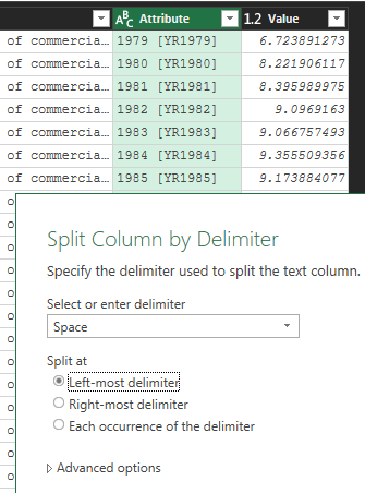
- With all of the Values/Year columns selected, I UNPIVOTED those columns to create a separate row for each year and country. As I’ve described before, each row should represent One “Event.”
- With only 5 columns remaining, I selected the “Attribute” Column, and Split the Column by Delimiter. I split it at the Left-most occurrence of a “Space”. This creates a column with a clean Year, which I renamed “Year”.
I’ll let you import/tidy the Olympic data! It should only take a few steps. You can do it…
Create a Pivot Table from Multiple Tables
After importing and cleaning the data with Power Query, I created a “Lookup” table. I created a new query from the Economic data file, and kept only the columns needed to relate to the other two queries. I created two additional, custom columns within the Lookup query.
This isn’t necessary, since you can create a Primary Key in the Economic Development table by Concatenating the Country Code and Year (Text). If the Country/Year was not unique, and you wanted to report on both tables, you would need a table like this with a column of Unique Country Codes + Years.
The First custom column is simply a duplicate of the Year field, formatted as Text. You could just change the Year field to Text, but that could potentially limit some reporting functionality in the future.
The Second custom column contains a concatenation of the Country Code and text version of the Year that you just created. This creates a unique identifier (Primary Key) for relating to other tables.
I left the Country Name and Year fields in the Lookup table in case I want to use them in tables or visuals.
To concatenate fields in a Custom Column in Power Query (or an Excel worksheet), separate the fields with &”_”&, where the underscore will be the separator in the new column. You can simply use One Ampersand (&) to separate the fields if you want them to be combined with no separator.
Here are two methods to create the Country Code / Year Concatenation:
[Country Code]&"_"&[YearTxt]The above would result would be each Country Code and Year separated by an Underscore. For Example: AFG_1979
[Country Code]&[YearTxt]This would simply combine the Country Code and Year without a separator. For Example: AFG1979
After loading all 3 queries to the data model, the next step is to create the relationships. I prefer to use the Diagram View, but you can also relate the tables via the pop-up. The pop-up requires you to choose each table from a drop-down, and select the name of each of the common fields to create a relationship between the two. The Diagram View allows you to visualize your data model and its connections. Being able to visualize the data model becomes increasingly important, as you begin working with more queries/tables.
Here is what my data model looks like in Diagram View that was created from the data sources above:

Notice that both Information Tables have Asterisks (*) at the bases of their connections, while the Lookup Table has a 1 at each connection’s base.. The direction of the arrows has changed throughout various versions of Excel, but the above picture is based on Power Pivot in Excel 2016 (Arrows pointing Away from the Lookup Table towards the Information Tables).
I didn’t filter the Economic Development data to only include years during which the Olympics were held, but that would be a good thing for you to test to see what happens to your results!
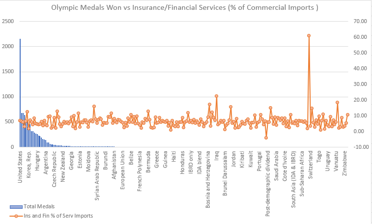
This data is not super interesting, but offered a good variety of formatting obstacles for importing and manipulating source data using Power Query. To see if there was any correlation between the total number of Olympic medals won by a country and the percentage of the country’s commercial imports that are made up by Insurance and Financial Services (WOW!), I created a simple Pivot Table that lists the Country Name in the column A, the Total Medals won in column B, and the average yearly Insurance/Financial Services (% of Commercial Imports) as column C.
It’s frustrating that Conditional Formatting does not persist on a column in a Pivot Table when it is changed or updated… I have included it for the screenshot below, but if you try to implement it, you’ll realize that it reverts back to the normal colors when a change is made. If you know a way to get around this issue, PLEASE let me know! You would be my hero (not that anybody wants that)!
It’s pretty clear that there is no correlation between these two random metrics, as you can see. Luxembourg is really throwing off the color-coding, with almost 61% of it’s Commercial Imports coming from Insurance/Financial Services, and having won no Olympic Medals…

Create Dynamic Charts from Aggregated Data
Now that you have queried the two data sources, cleaned and shaped the data, and created a Pivot Table to spot some trends, it’s time to build a dashboard. While we can come to some general conclusions by using the slicers to filter the data, a visual is an essential element of any dashboard. Not only do visuals provide a method for you to conceptualize the data, they’re almost required for most presentations or executive dashboards.
If you used Power Query to import data from a source that will be updated, you’ll be able to refresh all of your related charts and objects, simply by refreshing the queries. Here’s an example Excel Dashboard based on the Pivot Table above. Due to the randomness of the data, it’s not very insightful, but you get the point:
Share some of your tips, questions, or comments below. We’d all like to hear from you! Thanks for reading. I hope you will keep learning and experimenting with Power Pivot, and you’ll be building amazing business dashboards in no time.